RECENT WORKone website, three user groups: making everyone’s experience count
How can a single website section serve three very different user groups, giving each the information they need while keeping the platform unified and scalable?
Note: All concepts, designs and product identifiers have been redacted or abstracted in accordance with company confidentiality agreements.

Photo by James A. Molnar on Unsplash
the goal, my role and the result
Over 8 months, I led a small cross-functional team consisting of one junior designer and one researcher, and collaborated with engineers, PO, and stakeholders.
I drove discovery, research synthesis, design strategy and delivery in Figma.
The result:
a modular, adaptive platform that reduced bounce rates
increased engagement and product selection
aligned global teams around a scalable framework.
the challenge
One website section had to serve a variety of different user groups, including expert users, casual visitors, and everyone in between.
Technical and budget limitations meant it had to stay “one section”, but as it was, no user could reliably find the information they needed, and the business couldn’t drive actions effectively.
process and approach
I started by interviewing representatives from all three user groups across countries to understand goals, terminology, and decision points. Mapping and layering journeys revealed where motivations aligned and diverged, helping us target differentiation without creating separate paths.
What we discovered during the interviews was that, in the end all user groups would need expert information (or access to an expert) before making a decision. How long it would take them until they needed that information, and how much guidance they needed en route was where we started to put our focus.
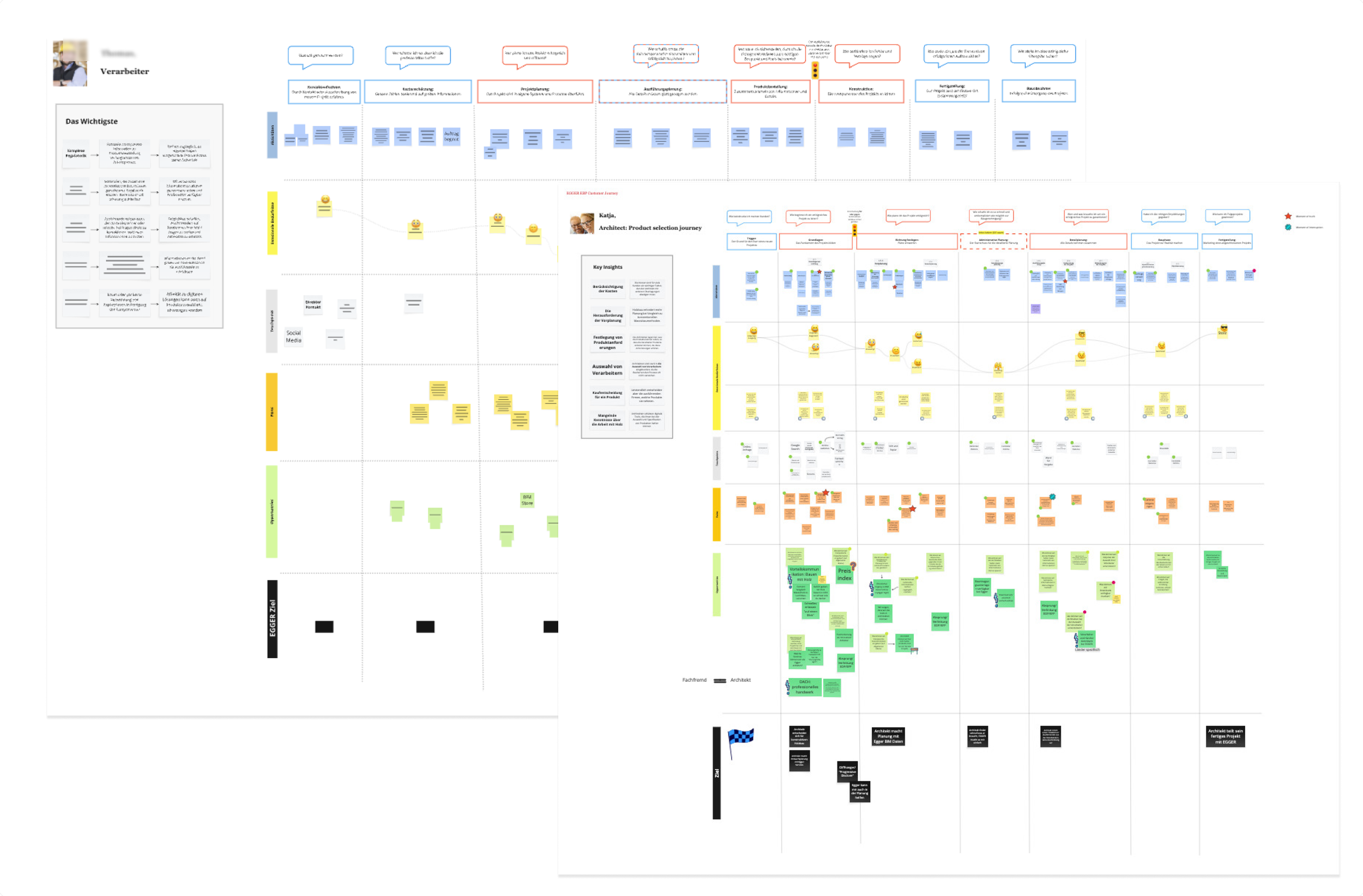
User journeys with clear indicators (red traffic light) where a user couldn't complete a wanted task.
Workshops with stakeholders identified key business impact moments, which we matched to critical user decisions.
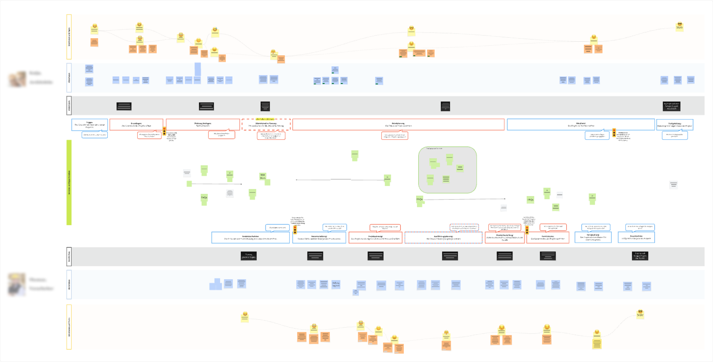
Mapping our business goals, based on value level, onto the "red traffic light" moments.
From there, I developed modular UI concepts in Figma that scaled depth based on user behavior, letting experts dive deep and newcomers stay guided.
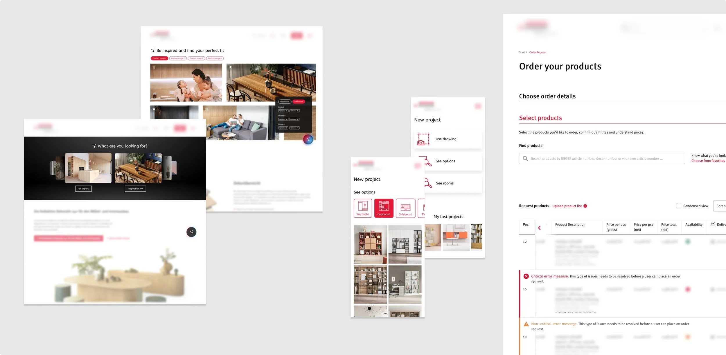
Impressions of final visual designs.
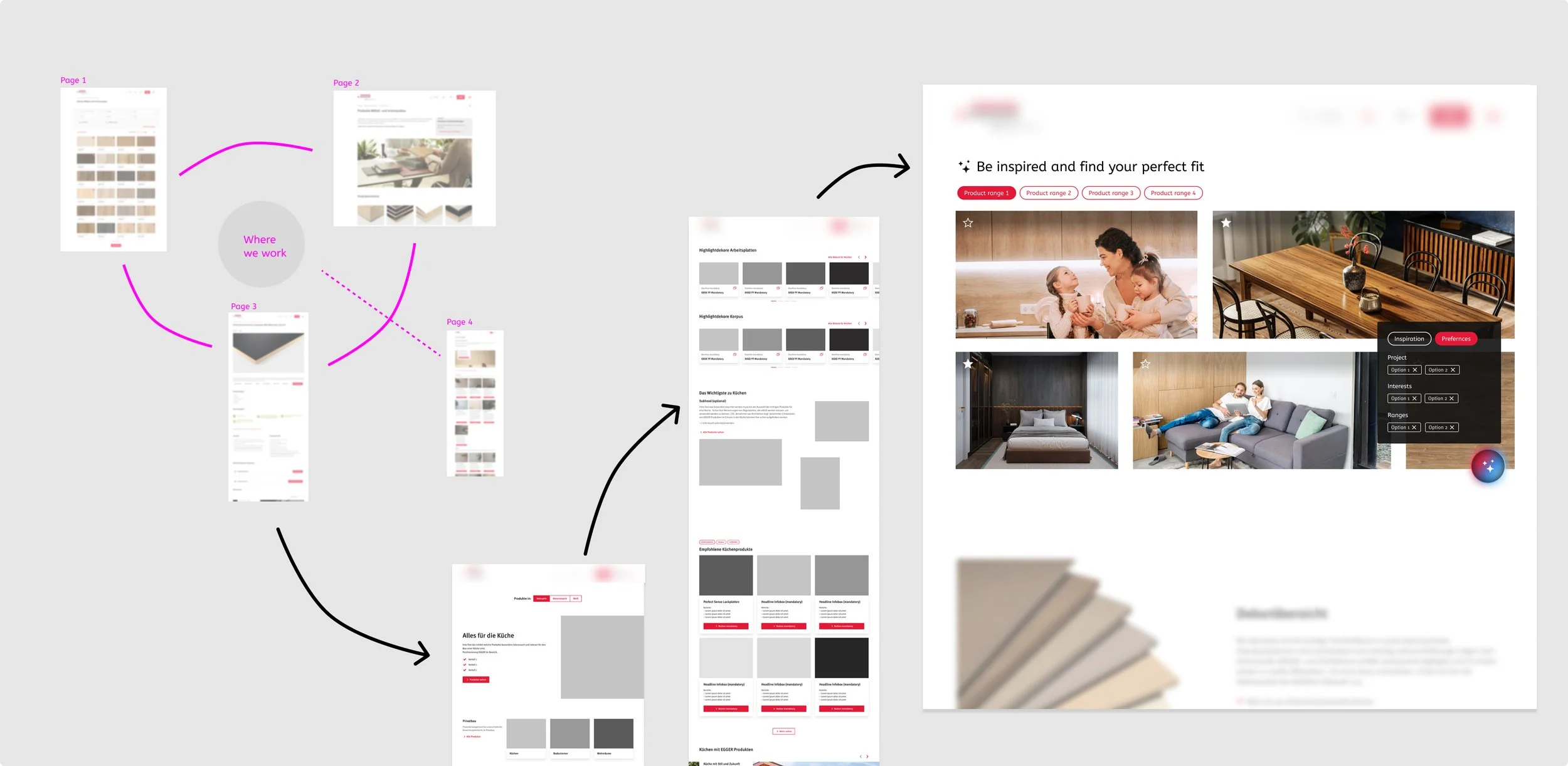
The development of the entry screen into the website section, starting from wireframes all the way through to final designs.
Testing across groups validated clarity and usability, and we iterated structure, hierarchy, and breakout paths to ensure self-selection worked seamlessly.
Outcome and impact
Here’s an overview of what we’ve achieved in this project:
Users quickly reached content suited to their knowledge and goals
bounce rates dropped by 50%, product selection increased by 20%, and engagement grew by 20%
the modular design is scalable for localisation and future expansion
the business now has a unified platform serving diverse audiences efficiently

key takeaways
Simplicity and modularity made the experience implementable and flexible, but starting earlier on technical constraints would have unlocked even greater potential.